How to Proudly Design 3D Book Images for Free

Design 3D book images?
It’s easier than you think!
After you’ve created amazing content, it’s time to market it.
To promote and sell digital content, you need to design book covers that readers will find irresistible.
But with Adobe Photoshop licenses priced at $120/year and up, you may not have the financial resources to create beautiful promotional material, or to hire someone to do it for you.
Never fear…
…GIMP is here!
GIMP is a free photo and image editor, available here. It is user-maintained, with nearly limitless capabilities.
How to design book covers for free
Follow this step-by-step guide to create stunning 3D book cover design for your ebook, online course, or audio/video series.
1. Prepare Your Cover and Spine
You will need two images— one for the cover, another for the spine.
Whether you design it yourself or receive it from a contracted designer, you will need the images in PNG format.
Note that these instructions are for a 8.5″ x 5.5″ book cover—modify your specifications accordingly.
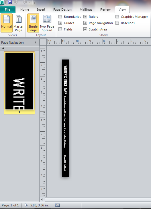
If you’re not sure how to do this, open the document in Microsoft Publisher. You can easily change the Page Size (under the Page Design tab) to fit the needed sizes.
Spines should be 8.5″ x 0.5″ for books with 200 or fewer pages. For books with more pages, create a 8.5″ x 1″ spine.
If the background of your cover and/or spine is white, give it a thin black border. This will give the book physical definition.
Here some helpful shortcuts in GIMP:
- To zoom in or out, click on a layer and press “+” or “-“.
- Ctrl+Z is the “Undo” command.
The most important buttons you will be using are:
2. Create the 3D Perspective
The Perspective
Open GIMP. Click “File –> New.”
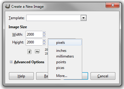
When the window appears, click the drop-down bar and select “Pixels.” Make the dimensions 2000 x 2000 and the color White. This will be your background.
On the menu bar, click “File –> Open as Layers” and open your Front Cover image.
Keep in mind that GIMP, like all professional image editors, processes images in layers. Think of layers as pieces of paper stacked one on top of the other. The Front Cover should go on top of the Background.
Click on Front Cover, then on the menu bar: “Image –> Canvas Size.” Make sure the dimensions are 2000 x 2000 pixels.
This gives you space to work.
Click “Resize.”
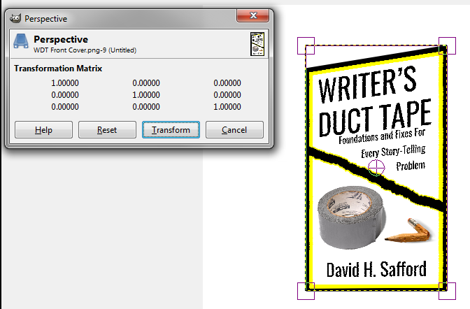
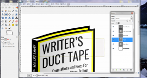
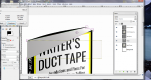
Select the “Perspective” tool, then click your Front Cover image. At each of the image’s four corners, boxes will appear, as well as the “Perspective” window. Click and drag the top- and bottom-right boxes to give your image an angled, 3D look.
The Curved Bend
Click on your Front Cover and then select in the menu: “Filters –> Distorts –> Curve Bend.”
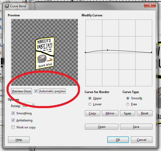
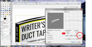
The “Curve Bend” window will appear. On the left is a preview of what your Cover will look like once it’s curved. Make sure you click “Automatic preview” to see what your changes will look like.
On the right is the “Modify Curves” box—your work area. Below it, note the “Upper” and “Lower” buttons that allow you to change the curve of the upper and lower sides of the image.
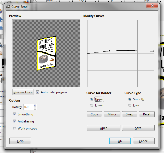
Make sure the “Upper” button is selected.
Point and click along the line: it will create a new point that you can drag to create the curved effect.
I recommend creating 3-4 points and pulling them up to form a smooth, gentle curve, allowing for greater bend towards the right end of the book, where a real paperback cover might curl.
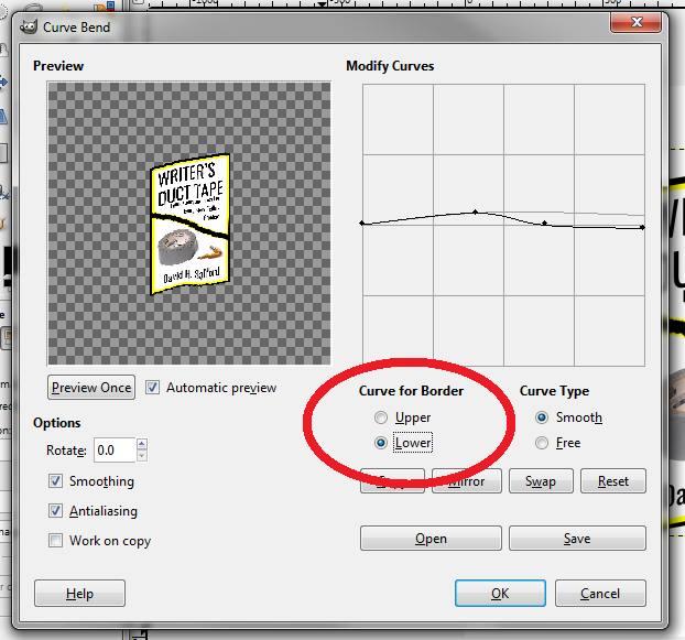
Now click the “Lower” button.
Now click the “Lower” button.
To the right is another button that says “Mirror.” Use it to match the “Upper” curve exactly.
Even if you decide to have different Upper and Lower curves, I highly recommend having them mirror each other at first, before adjusting them as you wish.
Note: The “Modify Curves” window does not factor how you’ve altered the angle of your image already. You will need to play with this and use Ctrl+Z to quickly undo a messy curve and give it another go.
3. Add the Spine
On the menu bar, click “File –> Open as Layers” and open your Spine Image.
As you did with the Cover Image, click on the Spine and then on the menu bar: “Image –> Canvas Size.” Make sure the dimensions are 2000 x 2000 pixels, giving you space to work.
Click “Resize.”
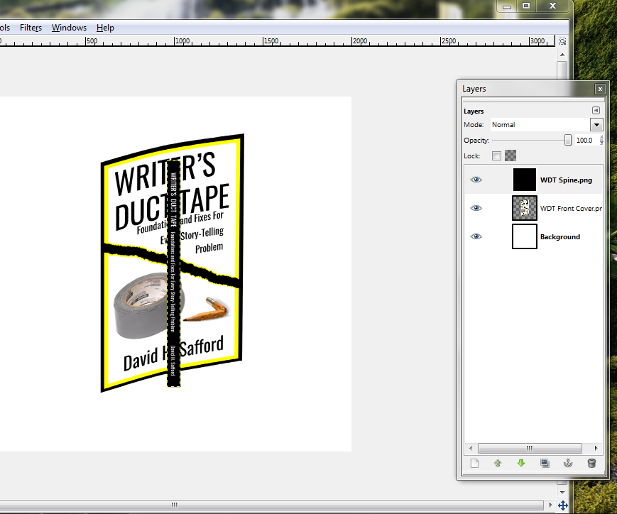
Select the “Move” tool. In the window below, make sure the “Move the active layer” button is selected and then click-and-drag the Spine to relocate it—otherwise you may end up dragging the background and pulling your hair out as I did!
As you move the Spine, line it up with the left of your Front Cover, but don’t worry if the edges aren’t perfect yet.
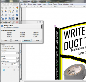
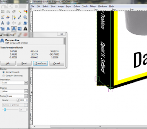
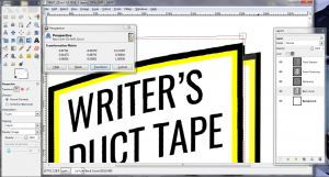
Choose the “Perspective” tool and click on the Spine. Pull the right corners to match up exactly with the Front Cover, using “+” and “-” to zoom in and out as needed.
Tug the Spine’s left corners up to complete the 3D illusion. When you’re done, click “Transform” in the “Perspective” window.
Double-check the borders, and repeat the process as necessary to make sure you have no thin white gaps between the Front Cover and the Spine.
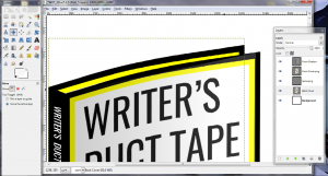
The image should appear on the right and have your Background, Front Cover, and Spine. Click-and-drag these up and down to sort them. The lower on the list a layer is, the farther back it will appear. The order from top-to-bottom should be “Spine” – “Front Cover” – “Background”.
Right-click these layers and rename them using the “Edit Layer Attributes” tool. Make sure each is properly named to avoid confusion.
4. Shade the Cover
It’s time to give the book some shading, as if it’s being seen in natural light.
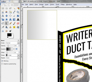
Your new 500 x 500 Shade layer should appear in the top-left corner of your working area. For now, leave it there.
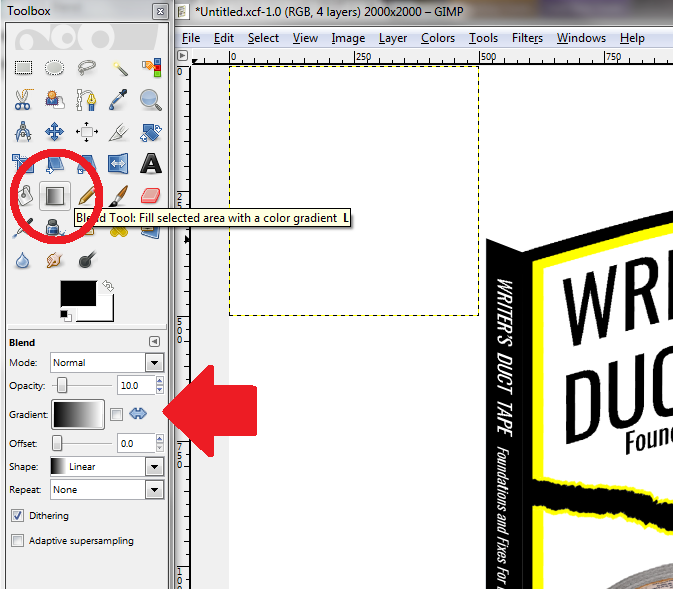
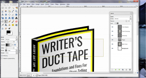
Click the “Blend Tool.”
This allows you to create a gradient shade in your new transparent layer, which you will eventually place over your cover.
In the “Toolbox” window below, make sure that the Mode is “Normal,” the Gradient progresses from dark to light from left to right, and the Shape is “Linear.”
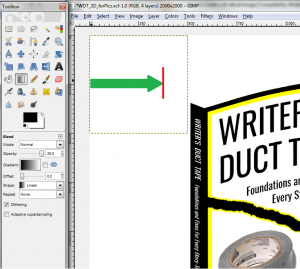
On the Opacity slider, adjust the value to 20.0, since you want your cover art to shine through the shading.
Place your mouse over the new layer along the left border, halfway between the top and bottom. Click and drag it about 3/4 of the way across the box and release.
A fading shade should appear, darkest on the left and disappearing as it moves right. Use Ctrl+Z to undo the shade if you don’t like the way it turns out. Adjust the Opacity value+ or the length of your click-and-release to get different results.
Select the “Move” tool, and click on the shaded box and drag it over the Front Cover, aligning its top-left corner with that of the Front Cover.
Now click the “Perspective” tool and drag the other three corners of the shade to match the four corners of the curved Front Cover. When you click “Transform,” the cover should have subtle, realistic shading.
Note: Based on how dark your cover art is, you may consider curving the Front Shade layer to match your Front Cover’s curved bend. This way, the Shaded layer won’t “spill” onto the white background.
5. Create the Back Cover
To give the impression of a book full of pages, you need a Back Cover to provide perspective.
Right-click the Front Cover in the “Layers” window and click “Duplicate Layer.”
Immediately, a copy of the Front Cover will appear in the “Layers” window, though you probably won’t see it in the main work window. Rename it “Back Cover” using “Edit Layer Attributes” (right-click it).
Use the “Move” tool to drag this new layer so that the top-left corner matches the top-left corner of the Spine. Then, in the Layer window, drag it down so it is behind the Spine and Front Cover.
Now use the “Perspective” tool to pull the top-right corner of the Back Cover up just slightly.
This will give it the appearance of a real book, where the back cover bends back just a little. Once you’ve made the small adjustment, click “Transform.”
6. Insert and Shade the Pages
It’s time to add interior pages to your book.
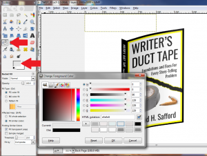
Click the “Bucket Fill Tool” and then the “Foreground Color” square.
The foreground (just below the other Tool icons) will be black, but this needs to be changed, since you probably don’t have black pages.
In the window that appears, choose a very light off-white color. Don’t go too gray. You may need to tinker with the color sliders to find an off-white that is just right.
When you’re done, click on the new layer you’ve created and watch it change color—however small the change.
Make sure all your layers are properly ordered. From top to bottom, your “Layers” window should display: “Front Shade,” “Front Cover,” “Spine,” “Pages,” “Back Cover,” and “Background.” If one of these is in the wrong place, drag it to the right place.
With the “Move” tool, relocate the gray box so the top-left corner is close to the top-left corner of your Spine / Back Cover. It doesn’t have to be perfect—just get it close.
Before adjusting the perspective of the Pages, we’re going to add a little shading like we did to the Front Cover, only this time we will shade the Pages layer itself without creating an additional layer.
Click the “Blend” Tool again, and change the foreground color back to black.
Keep the Opacity at 20.0, though you may want to decrease it to 15.0.
Once again, click along the left border at the midpoint of the Pages layer, drag it two-thirds of the way across, and release. You should have a gradient shade along the image (though you may not see it yet, as it is behind the Front Cover).
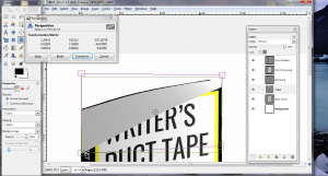
Click the “Perspective” tool and then on your Pages layer.
Click and drag the top corners so the angle of the box matches that of the Back Cover. Drag the bottom corners so they are hidden behind the Spine and Front Cover, but still keep the area where real pages would be filled with color. Remember that “+” and “-” can help you zoom in and out of these corners quickly so you can make them align exactly.
Finally, it’s time to curve the Pages. Click “Filters –> Distorts –> Curved Bend.”
Be aware that this part can get a little frustrating, so be patient.
It’s time to curve the Pages so they match the curve of the Back Cover.
The Curved Bend dialogue box has lightly stored the curves you used for the Front Cover. However, these may not work as well as you’d think.
Using the curved points, do your best to mirror the curve of the back cover on the Upper bend. Ignore the Lower bend, since it will be hidden behind the Front Cover.
This step requires a lot of trial-and-error, so be prepared to repeat this step a few times.
Click “Okay” to see the results of your work. If the arc doesn’t match the Back Cover, use Ctrl+Z to undo it and try again. Once you get the arc to match the Back Page closely enough, move on to the next step.
Click the “Perspective” tool once more.
Drag the corners up or down as needed to mirror the Back Cover, creating a thin border that will give the image clear definition between the covers and pages.
Click “Transform” when you are done, and use Ctrl+Z to undo and repeat.
You may need to alternate between the “Perspective” tool and “Curve Bend” to get it right. This is easily the most difficult step, but you’re almost at the end of creating a great marketing product.
Be patient, and don’t give up!
7. Give It a Shadow
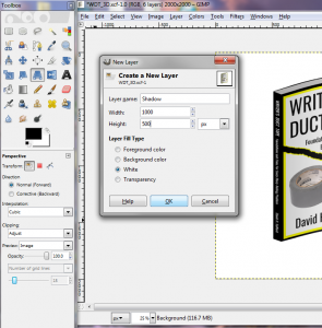
Create a new layer (“Layer –> New Layer”) that is 1000 pixels wide by 500 tall named “Shadow.” In the “Layers” window, drag this below “Back Cover” but above the “Background.”
Use the “Bucket Fill” tool to recolor this area a gentle gray. It can be a bit darker than your Pages, but not much. You’d be surprised how light it can be and still look authentic.
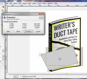
Use the “Move” tool to relocate the Shadow behind the book, aligning the bottom-right corners of the Shadow and the Front Cover.
Then use the “Perspective” tool to drag the bottom-left corner of the Shadow to match that of the Spine. Pull the top-left corner of the Shadow out, roughly half the width of the Front Cover itself, and a third of the height. Finally, move the top-right corner up so it is just above the top-left corner, accounting for the curve.
Click “Transform.”
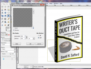
Change the “Blur Radius” so that the Horizontal and Vertical are both 25 pixels, then click “OK.”
To adjust, click on the Shadow once more and use the “Perspective” tool to drag the corners to get the angles right.
8. Save and Publish Your Book Cover Design
You’re almost done.
 GIMP files save in .xcf, a format that allows you to reopen the GIMP file with all of its distinct layers.
You would be wise to save a version in .xcf in case you wish to revise the file in the future.
But you can also save it as a PNG file. Do so, and you can crop out the excess Background space as you wish with a simple editor like Microsoft’s photo viewer.
Here’s a video showing you exactly how to do it:
When done, you will find your complete 3D image ready to be published and printed on any platform!
Now, use your book cover design to promote and sell your incredible content!
Now, use your book cover design to promote and sell your incredible content!
- Center it on your landing page or pop-up.
- Put in your website’s sidebar or footers.
- Make it the featured image on a sticky post that greets every click of traffic.
Keep experimenting with the diverse tools GIMP has to offer, and share your success with the community!
Have you had success designing marketing materials with GIMP? Please add your tricks and tips in the comments.
And if you liked this post, share it on social media!
ABOUT THE AUTHOR
David Safford
David H. Safford is joyfully addicted to coffee, which is why he wrote Coffee Bar, a novel about saving the world with everyone's favorite bean beverage. He is also the author of the word artist's free resource Writer’s Duct Tape, packed with foundations and fixes for every story-telling problem
Resource: https://writetodone.com/design-book-covers/

No comments:
Post a Comment